best parents
UX/UI Designer
re-designing the website
Company
bestparents.com
Duration
2020
My Role
UX/UI Designer
Role Responsibilities
Website Redesign & Logo Re-Vamp
//about best parents
Best Parents Inc is a global education company based in San Francisco with 13 years of worldwide experience in our executive team for international accredited summer and winter camps. Since 2020, Best Parents has expanded to 62 countries in 8 different currencies, the number of accredited education companies they have collectively worked with has risen to 2000+.
I was tasked with a website re-design to help instill trust and modernize the website.

//logo re-vamp
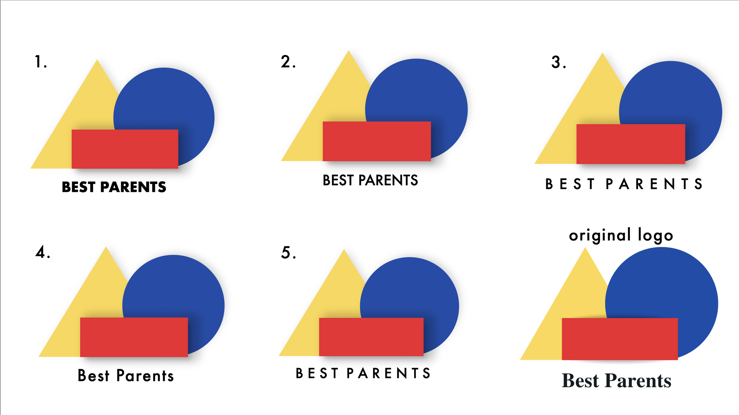
Best Parents liked their logo but it felt very flat and they wanted to modernize it. I presented a few ideas which you will see below to help make the logo feel more 3D. I presented a few different font ideas as well as added shadowing to the current shapes to emphasize the 3D aspect. A simple font change, spacing, and shading goes a long way! They decided they loved #3 which you will see throughout the re-designed pages.
//website before
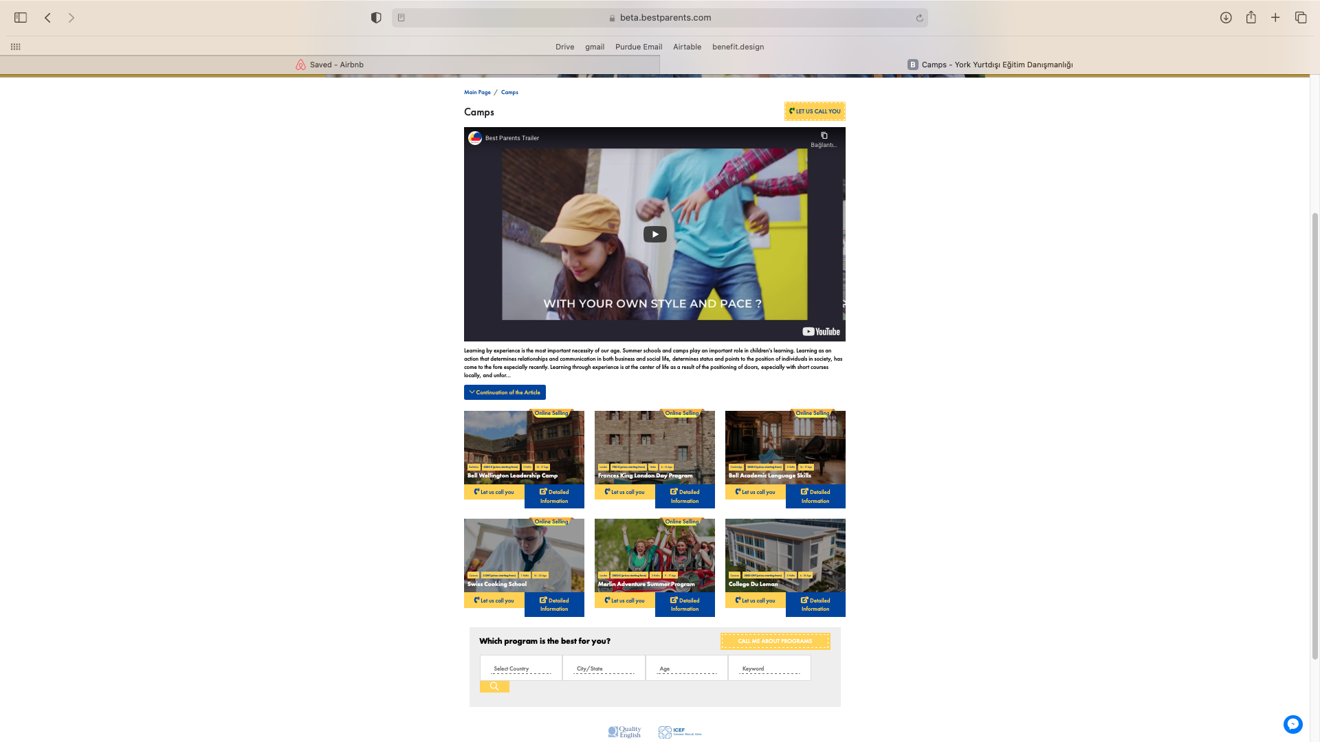
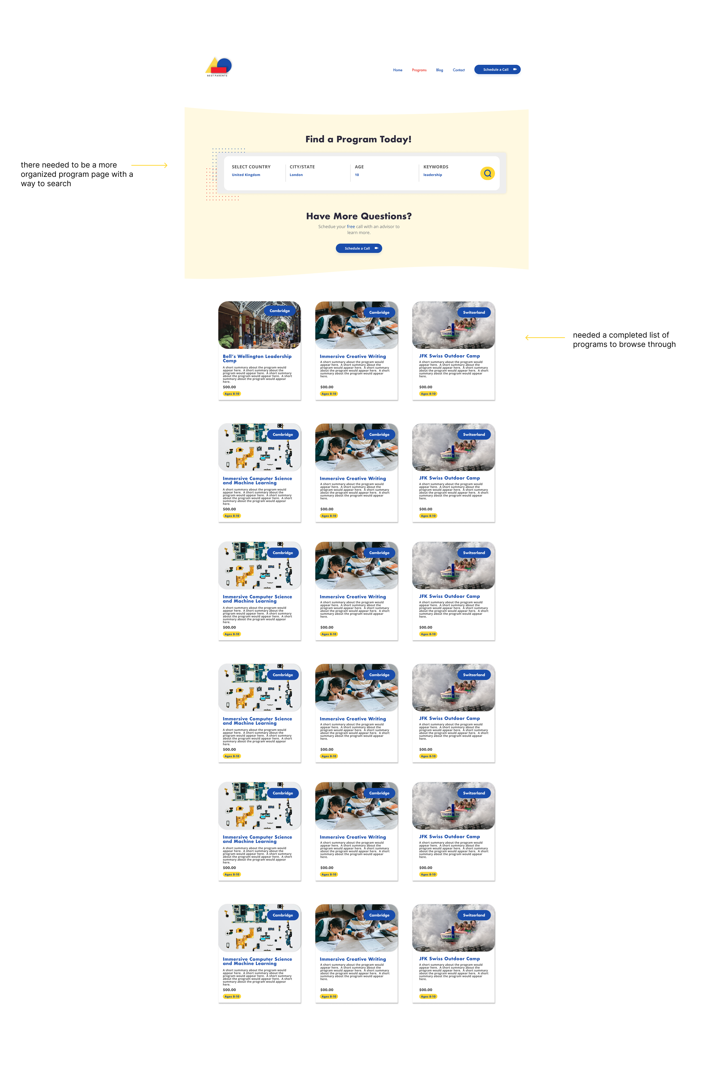
I was tasked on the redesign of bestparents.com. It was my first freelance/volunteer position as this was their early stages of a start-up and not yet funded. You can view the before here in this Figma file. They only had 1 developer at the time so it was a pretty straightforward website with a main page (home), summer programs, blog, and contact. They had the capability to search based on country, city, state, keyword.


//beginning stages
My first step was creating some sort of style guide with imagery to guide me through the re-design. For this website re-design I was still discovering what my design style was. I would say in terms of consistency, my design style was all over the place. If I could go back, I would create a design system (something that wasn’t really created or available back in 2020. I would also re-evaluate such bright and primary colors and find better secondary colors.

//ideation & process
I spent a lot of my time looking at other educational websites, websites I enjoyed, and the Figma community designs. I didn’t want this to be your typical educational summer camp website and wanted to make it more modern than it was. At the time they only had a developer.
Methods Used Before The Final Product:
Sketching
Wireframing
Prototyping
//homepage
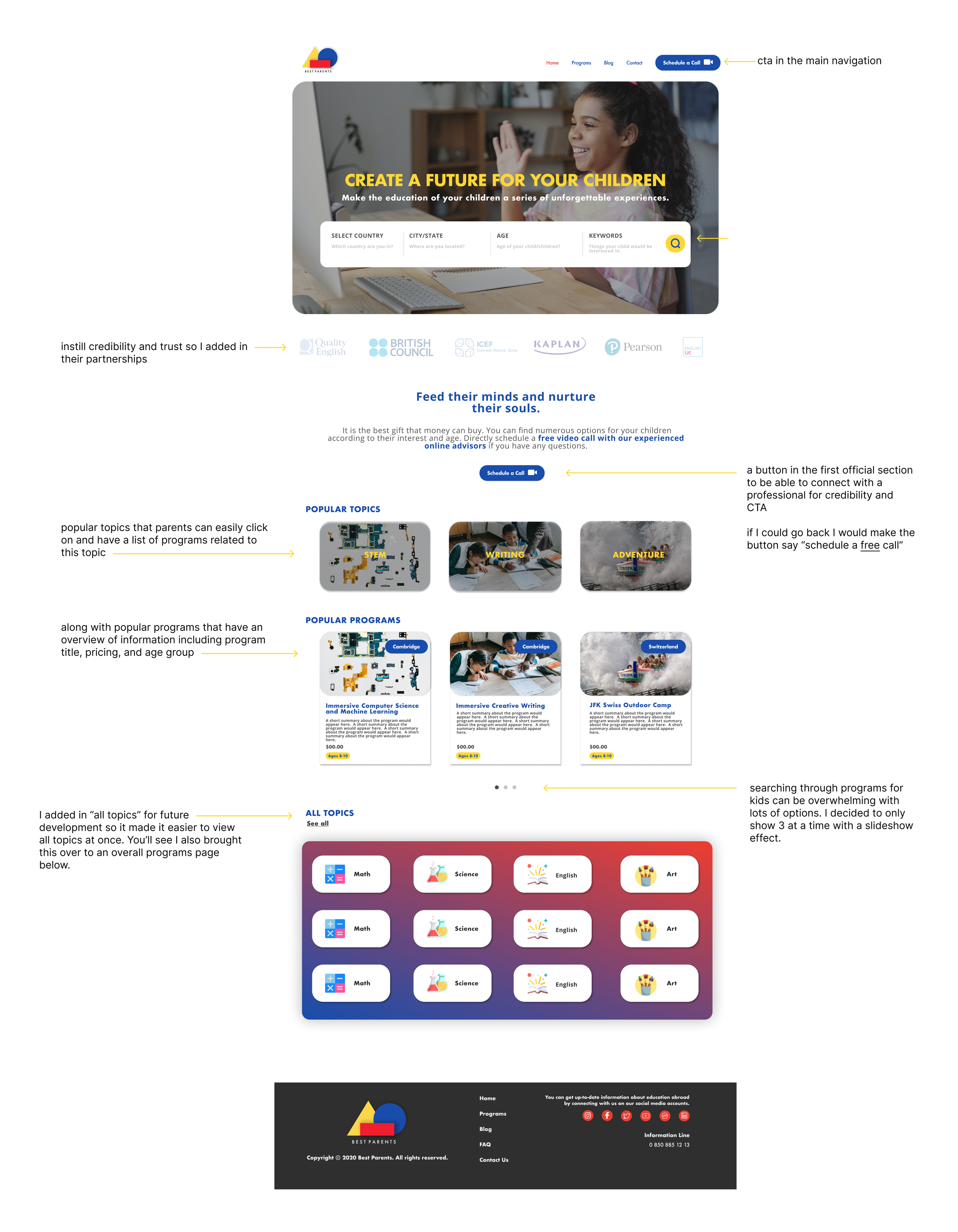
For the original homepage design, they included a searching feature and popular programs with a basic about them section in the main header image. I worked with the founders to make the CTA more obvious. They wanted to draw focus on the ability to call and talk to a live professional to ask questions about the programs. I wanted to instill credibility and trust so I added in their partnerships and a button in the first official section to be able to connect with a professional. They also wanted to make it known that this call was free.
You’ll see I also drew inspo from air bnb and made the searching for programs the main feature set at the top of the page.
Lastly, I spoke with the owner and asked what was important for parents- popular programs or popular topics? After some ideation and chats, we ended up adding in “popular topics” along with “popular programs” on the home page. We only highlighted the top 3 so as to not overwhelm the user with options. Something I added in for future development was all topics so it made it easier to view all topics at once. You’ll see I also brought this over to an overall programs page.
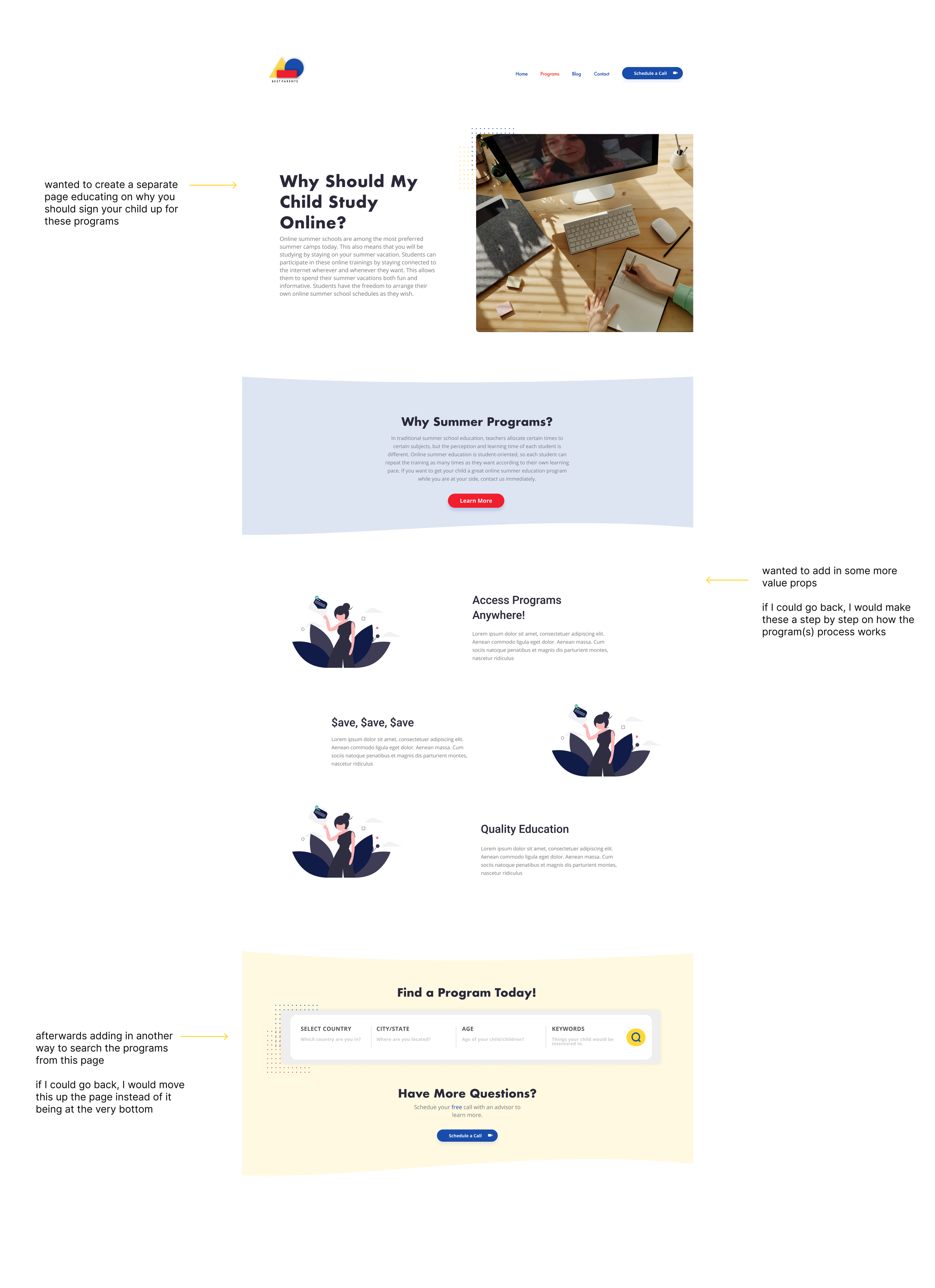
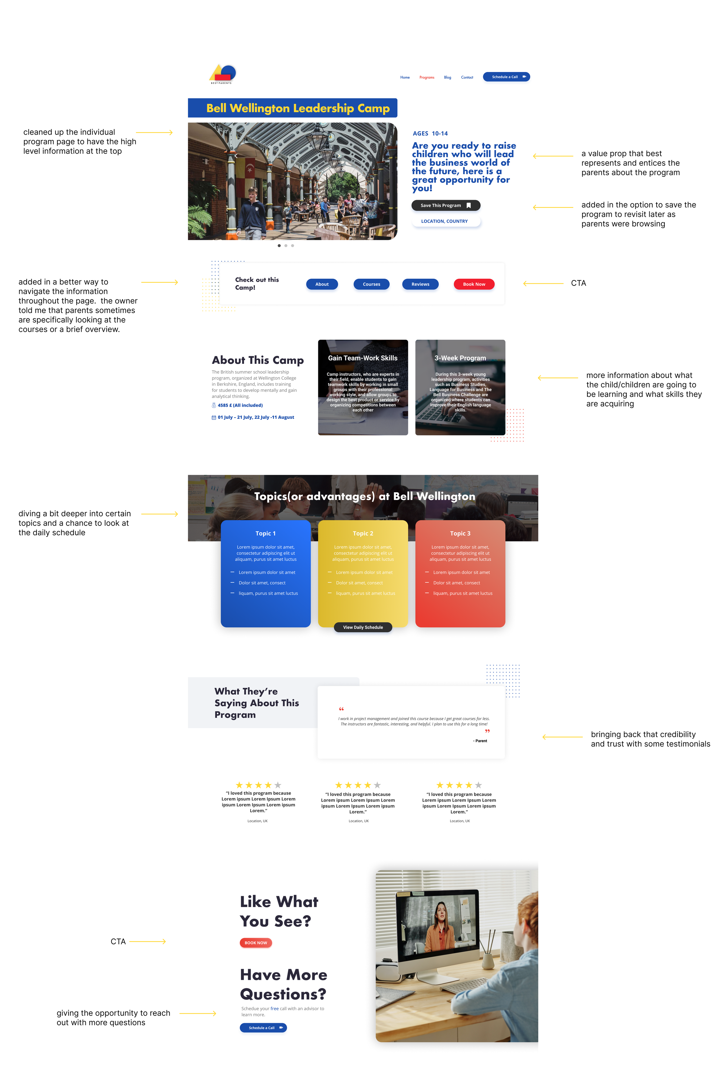
To keep building that trust, I decided that an individual program page was necessary to give a little more info about the programs and why parents should choose Best Parents. I also created an individual page with all the programs to easily search. In addition, I re-vamped the individual program page. I moved the most asked information towards the top which included description, location, saving the program (for future development), age range, & courses. Some parents were also questioning what kind of topics there might be, so we gave a small sample. Again, bringing back that trust by offering testimonials from other parents and their children.
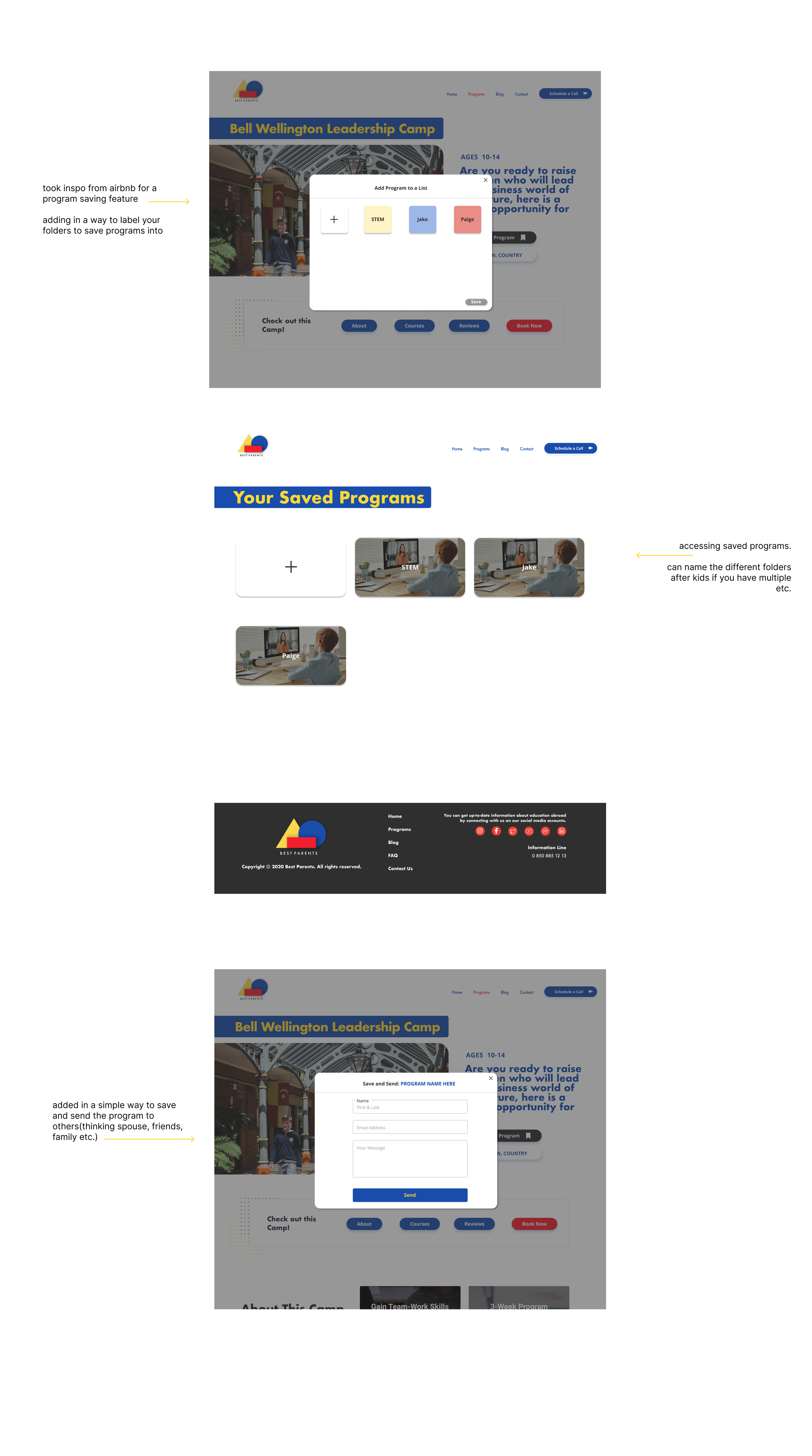
One website I drew inspiration from was Airbnb. I really enjoyed their easy process of book-marking/saving my favorite locations and homes. There is nothing worse than finding something you like and then losing later because you didn’t bookmark the page. With that in mind- for future development, I created a a program saving feature which you can click and see below. You may also visit my Figma file with the completed designs here.
//program pages
//pitch video
With Best Parents being in the early stages of their start-up they wanted a nice, quick pitch video to bring to y-combinator. I am no video creator or expert but I was able to use a free video making tool to knock this out. Check it out below!